Tuesday, 29 March 2011

Fun Photo Shoot

My cousins are in a band and asked me to shoot some promotional shots which could be used for merchandising and for their website. I fully charged my battery and took with me my tripod as  we would be shooting indoors and a slow shutter would be needed.  I took my Nikon D90 camera and my 18-105mm lens and Nikkor 105mm Macro lens for any close up portrait shots.  We borrowed some lighting equipment  which consisted of two softbox lights and two umbrellas for the side to stop any shadows forming on the back of the greenscreen.  We had a green screen backdrop which is a good colour for using if you want to change the background on any images in post production.  The green screen can be removed very easily and different backgrounds added.  We positioned two lights in front on the side and then used umbrellas to diffuse the light so no shadows were cast against the green screen.

Green Screen technology is the effects used in everything from Hollywood Movies to the weather forecast.  Its a single colour backdrop which is normally blue or green.  Using Green Screen technology it is really simple to superimpose anything or anyone into any shot.  Here I have just changed the colour of the background in photoshop but different backgrounds can also be used.

These images were all shot with my 18-105mm lens except the close up shots of Emily which were taken with my Nikkor Macro 105mm lens.  For all the shots I used a medium to wide zoom of in between 24-80mm which is a good focal length for group and full length portraits.


1/30s F7.1 ISO 400
1/15s F5.6 ISO 400

1//30s F7.1 ISO 400

1/30s F7.1 ISO 400

1/30s F7.1 ISO 400

1/30s F8 ISO 400

1/30s F8 ISO 400

1/30 F7.1 ISO 400


1/30s F8 ISO 400


1/30s F8 ISO 400


1/30s F8 ISO 400


1/30 F8 ISO 400


1/30s F8 ISO 400


1/30s F8 ISO 400


1/30s F8 ISO 400


1/30s F8 ISO 400


1/30s F8 ISO 400


Evaluation

I really enjoyed doing these shots it was really nice to photograph people you feel really comfortable with and we had a great time doing it.  We are planning another shoot tomorrow but this time in costume while we still have the lighting equipment.  The backdrop was creased which shows through on some of the images but this can be rectified in photoshop.

Safety Considerations

Whilst shooting this shoot every care was taken for the safety aspects.  There was lots of wires around for the lighting equipment and very little space.  I ensured that all the wires were in a safe place and there was no possibility of anyone tripping over.  There was no drinks or liquids around to eliminate any possibility that any liquid could be spilt onto any equipment or electical goods.  All the lighting equipment was checked to ensure it was erected properly so no accidents could occur with lighting falling over.


Books used for research before this shoot

John Hedgecoat - The art of Digital Photography
Ilex - Portrait Techniques

Sunday, 27 March 2011

Photography in the style of Annie Leibovitz

I have created some images in the style of Annie Leibovitz.


Annie Leibovitz


Tuesday, 22 March 2011

Research: Rankin

I have chosen Rankin to research as I am hoping I can learn more about expression and how to bring out the best in people to capture something really special, something more than just a photograph of a person.  I want to be able to capture the subjects personality and hopefully bring that out in the image captured.

John Rankin Waddell was born in Paisley Glasgow in 1966.  Rankin went to Brighton Polytechnic to study accountancy but by the age of 21 discovered that photography was his passion.  After doing a few college magazines in 1992 Rankin set up Dazed and Confused magazine with Jefferson Hack and by the mid 90s the magazine became really popular covering British Music,Art, Fashion and Film.

Rankin's style of Photography is Portraiture and particularly really intimate portraiture.  He is inspired by people and likes to know a lot about the people he photographs, to bring out the mood and emotion.  When photographing people he talks incessantly to the person to try and capture their personalities rather than just taking their picture.

After setting up the magazine this opened up opportunities to photograph Britain's pop bands including Pulp, Blur, Kylie and Madonna.  Rankin then propelled into doing covers for German Vogue, Harper's, Bazaar, Arena and GQ Magazine.

I like this image of Sienna Miller taken through a blind.  The composition is based around lines and reflection with a frame being made around the eyes.  This image has a good tonal range and the main focus is on the eyes which are framed between the blinds.  The image is in black and white and I love the way the shadow of the blind reflects over the face.  A shallow depth of field has allowed the background to blur out.


This image has the subject off set in the picture representing the rule of thirds.  I like this image the way the hair is blowing across the image and I also like the art work on the models skin with adds patten and texture especially within a black and white image.

I love the expression which has been captured in this image I almost imagine him to be roaring which just shows how Rankin likes to capture more than just a portrait but part of the subjects personality.  I like the way the subject is heavy in the frame leaning forward.  The expression shows great confidence with a little craziness which is probably what Rankin was hoping to achieve.

I like the position of this image which has been taken with the subjects head held back.  I like the way the image really shows the shape of the subjects face and a flawless complexion.  I really like this portrait, I like the colour used in the backdrop which contrasts really nice with the colour of the skin and the dark hair.


This black and white image has great patten and texture because of the tattoo.  He appears to be slightly off set which creates a slight rule of thirds.  The facial hair and the hair over the face has created a really nice contrast and tonal range.


This image of Pete Doherty is very low key with a good contrast caused by the black cat and the pale complexion of the subject.  I like the way they are both looking downcast with a doleful look.  I like this type of image with a dark backdrop and low key clothing with only the face lit by light.


This image shows the composition aspect of reflection and the Rule of Thirds.  I like the way that each side of the body has been captured in its own reflection the hand on one reflection and the gun on the other.  This image has good pattern caused by the shadow on the backdrop and the subjects legs causing an intertwined image.


I have seen many images of Madonna in the past but this shows her in a almost vulnerable pose which is not how we normally see her.  I think Rankin has captured something really special in this image by intertwining her hands almost like a child he has taken down the barriers of how we normally see her and left a rather humble expression.

Sunday, 20 March 2011

Research: Annie Leibovitz

Annie Leibovitz was born in Connecticut on 2nd October 1949.  Her father was in the US Air force and she took her first photographs while stationed with her family in the Philippines during the Vietnam War.  Annie attended the San Francisco Art Institute and developed her photography whilst working several jobs and living in Israel for several months.  Much of Annie Leibovitz inspiration was taken from the works of Robert Frank and Henri Cartier Bresson and their work of personal reportage.

In 1970 she began work at the Rolling Stone Magazine and in 1973 Jann Wenner co founder and publisher made her chief photographer.  During this time she photographed the Rolling Stones at the time Robert Frank was touring with them so she got to watch Frank work.  A few years later Annie got to go on tour with the Rolling Stones and be their tour photographer before going on to work for Vanity Fair and Vogue Magazines.


This is probably one of Annie Leibovitz most famous photographs of John Lennon and Yoko Ono taken on December 8th 1980.  Annie had wanted John on the front cover of Rolling Stone magazine but John wanted him and Yoko on the front cover.  It was Annie's idea that John should be naked and Yoko fully clothed.  This image shows his vulnerability towards his wife and how much he must have loved her.  John Lennon said she had captured their relationship perfectly.  A few hours after this picture was taken John Lennon was shot dead.


The next three of images are taken from Annie Leibovitz, American Music Exhibition which is a travelling exhibition of seventy black and white and colour images taken of American Musicians in intimate settings.
Twenty five years after starting at the Rolling Stone magazine Annie decided to photograph music with a mature eye so she travelled around America and created portraits with her own flair.  These images were mainly shot in 2001 and 2002 although she did use some images shot from the 70s.


This image is Pete Seegar an American Folk Singer and all that is captured is the banjo being held.  I really like images of musical instruments in black and white especially when captured  old musical instruments. The image has nice perspective and the composition aspect of the rule of thirds shot with a narrow depth of field the background is blurred bringing your focus to the instrument.  The image has a nice tonal range and contrast with the banjo against the background and the fret board.


This image of John Frusciante the former guitarist with the Red Hot Chilli Peppers has so much going on your eye is guided all around the image.  Using the composition aspect of the Rule of Thirds with almost everything within the image together with lines the subject seems unaware of what is happening almost lost in the music.  I think this image was taken after John left the Red Hot Chili Peppers and shows him alone surrounded by musical instruments and no band members. 
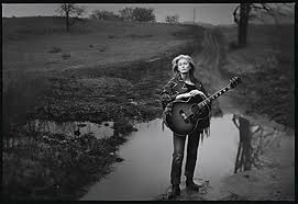


I really like this image of Emmylou Harris which was taken in Franklin Tennessee in 2001.  This image shows a country singer stood in the middle of the countryside with a guitar and this is the typical kind of work you can expect from Annie Leibovitz.   This image represents the composition aspect of lines and the rule of thirds as the road behind the subject guides the eye through the image.  This image appears to have been taken at an angle slightly above the subject which has ensured that the road and landscape behind has remained fully in the image.
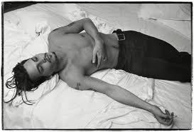

This image of Johnny Depp taken in 1994 in New York.  Johnny Depp has a really interesting look which makes him naturally photogenic.  This image shows Depp in dark trousers against his dark skin and dark hair which is then contrasted against a high key background.   His expression is listless and uninterested in whats going on around him.

Reportage is an important part of  Annie Leibovitz photography, the early images taken in the Philippines and later in 1982 she covered the Israeli invasion of southern Lebanon for the Rolling Stone.  This image was taken in Sarajevo in 1993.  Its almost as though the bike has come to a standstill and war has taken over.  Bikes can make very interesting images I think it must be the lines but this image I think is a sad image.


Celo, Bosnian Army Commander, Sarajevo 1993.  This image was taken during a trip in which Annie went to do a set of portraits which Vanity Fair agreed to publish.  You only had what you could carry, a backpack full of clothes, a bullet proof vest, a Contax with small variety of lenses and a Fuji 6x9 with fixed lens.


I like the contrast of this image with the low key background of the leaves and the high key tones of the chair and the dress.  The rule of thirds is present with the positioning of the subjects.  I like the textures which are created with the leaves and the fabric.


I really love this image which simply shows a contrast of expression.  A really nice contrast is present with the dark background and the image has a nice tonal range. The focal point is on the faces and the image is framed close to the subject.
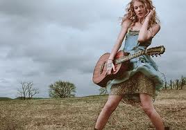


This is one of my favorite images as I really like the colours within the image.  The colours have been achieved in post production which give a nice soft touch to the image.  The rule of thirds is present with the subject.  This image has been taken at a low angle which has captured the clouds in the background present prominent within the image.

Tuesday, 15 March 2011

Annie Liebovitz - Life through a Lens Documentary


Last night I watched Annie Leibovitz, Life through a lens documentary about the life of famous photographer Annie Leibovitz.  I really enjoyed this documentary and anyone who has not yet seen it I would definately recommend it.  I had already planned to research Leibovitz because of her collection American Music and the work done whilst touring with the Rolling Stones but after watching this documentary I can say she is probably my favorite famous photographer.

Research - Black and White Photography

Since the beginning black and white images have been amongst the best to inspire and move us. Virtually all of us can appreciate that black and white images hold something very special and an average image shot in colour can almost come alive when converted into black and white. 

To see the world with monochrome vision is quite tricky but its good tip to switch your camera to monochrome and then use the LCD to view the world in black and white.  This way you can view different situations and view them in black and white without having to press the shutter.  It is however, better to shoot the images in colour and convert to black and white later in photoshop as this gives more control over the final image.

Using a Macbeth Chart also allows you to view the different colours in monochrome.


This macbeth chart is showing the colours when converted to black and white the charts vary slightly when different techniques are used such as desaturating and image and using the hue/saturation to convert images.

When shooting in black and white there is no colour to guide the eye around the image so you have to look for shapes, tones, patterns and textures.  Light and shadows also play a very important role as shadows create tone and contrast within the image.   Shapes and lines can also play an interesting role when producing good black and white images.


Filters and Monochrome

  • Red : Darkens the sky and foliage making this a good choice for moody landscape images.
  • Orange : This filter is similar to the red filter but with a less dramatic effect
  • Yellow : Less of an effect than orange.
  • Green : Darkens reds and blues and lightens greens and yellows.  This filter is good for portriature as it can improve skin tones.
Optical filters work better than the filters used in photoshop but as I do not have any optical filters as yet I will be using photoshop to use filters if needed.


Research Material Used

The Photographers Eye - Michael Freeman
Photographers Monthy - March Issue
Digital SLR Photography - March Issue

People, Black and White

It was such a beautiful day on Sunday I went to practise shooting some Black and White photography for my first theme People and Portraits.  We went to Lichfield as the old part and around the cathedral is really beautiful with some really old buildings and streets.  I charged my battery so I had full power and took a spare memory card.  I took my Nikon D90 camera with 18-105mm F3.5 - 5.6 ED VR lens and my Nikkor 105mm F2.8 AF-S VR lens.  I did not take my tripod as this was only a practise to experiment with pattens and textures and to practise seeing the world with monochrome vision.

I took quite a few images but with the bright sunlight, not really being able to view the LCD because of the sunlight and constantly having to alter the camera settings I did not shoot anything that spectacular whilst viewing the images in colour.  I then began to change the images to Black and White in photoshop and adding a few filters here and there and then I realised that some of them are not too bad.  This is why I love Black and White photography so much because changing an image to Black and White can transform a not particularly good image into something else.

1/320 F5.6 ISO 250

This Image has been shot with my Nikkor Micro Lens 105mm and the F5.6 aperture has allowed the narrow depth of field and blurred out the trees in the background forming a really nice patten and texture.  This is a natural image as he was climbing a climbing frame at the time.  There is not much contrast within the image but it still has quite a nice tonal range with the hat against the patten of the trees.  A dark hooded top could have made for a little better contrast in the image. The high shutter speed was needed with the large aperture for exposure.
1/320 F5.6 ISO 250


This image was shot with my Nikkor Micro lens and the F5.6 aperture has created a narrow depth of field and blurred out the trees in the background but the framing of the climbing frame has remained in focus.  I have turned this image to Black and White in photoshop and then used a green filter which improved the image slightly and evened out the skin tone.  I have also cropped the image in photoshop slightly.  The fast shutter speed was needed for the large aperture for exposure.


1/640 F5.6 ISO250

I took this image to show how pattens in black and white can create very nice tone and texture.  When shooting black and white you have to rely on pattens and textures as there is no colour.  Shot with my macro lens the 640 shutter speed was needed for exposure.  I like the way water looks in black and white when it is moving like where the boot is in the water it creates a really nice patten which is more prominent in black and white.  Also shadows are a good thing to look for whilst shooting black and white as these also add tone to the image.

1/640 F5.6 ISO 250


I have used a green filter over this image of the signpost which turned the flowers white adding a really nice contrast which was not there before adding the green filter.  The large aperture has allowed for a narrow depth of field and blurred out the background against the signpost.  This image shows the compositional aspect of balance and the rule of thirds. The image has a nice tonal range with the flowers and the signpost


1/640 F5 ISO 250


This image was shot with my Nikkor Micro lens.  Shot with a F5 aperture this has allowed for a narrow depth of field blurring out the cathedral in the background.  I like the patten and texture the cathedral has created in the background.  There is a shadow cast across the face because of the cap and I should have asked him to remove his cap to see the difference in the images. The sun was very bright and the 1/640 shutter speed was needed for exposure.  The tonal range is quite balanced in this image and there is not much contrast.  Darker clothing would have created more contrast and together with the busy background this would have created a very different image.


1/640 F6.3 ISO 250


For this image I have used my 18-105mm lens.  The steps show great form and show a three dimensional apperance in the two dimentional picture.  The railings show the compositional aspect of lines together with the shadows, steps and the window frames and brickwork which all guide your eyes around the picture.  The sunlight has allowed a nice tonal range around the image.  There is also lots of pattern and texture within the image. 


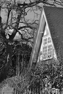
The following images do not include people which are the reason for this practise but I have included them because I like them and because the cottage shows how when there is a lot of detail in a black and white photography this can add patten, texture and a good tonal range in the image.

1/400 F5.6 ISO 250


1/640 F5.6 ISO 250

Evaluation

To evaluate the exercise it did not go as well as I wanted.  Although these are really nice images and I do like them I still need to practise more with the camera controls. I did not change the ISO throughout the whole exercise the simple reason being I keep forgetting.  I have researched quite a lot on black and white photography and I need to change the ISO to see the difference as many people say to shoot with the ISO set high to create noise and produce grain within the image. But still ,I keep forgetting about the ISO.  I will do another practise and remember to set the ISO on high and also I need to play with the shutter and aperture controls a little more to see what can be created once changed to black and white.

I have just experimented using a high ISO to create the noise and get the grainy effect but I do not like the results and think if required this is something better left to post production.  I think black and white images look better when shot with a low ISO.